


Many U.S. Households Feel Like They Can’t Get Ahead Financially – and They’re Right

Alicia H. Munnell is a columnist for MarketWatch and senior advisor of the Center for Retirement Research at Boston College.
3 persistent myths about workers and income.
The Census Bureau’s annual report on trends in household income always provides an opportunity to compare facts with perceptions. Theses misconceptions relate to what it means to be in the top 50%, the growth in income and earnings over time, and in inequality in the distribution of income.
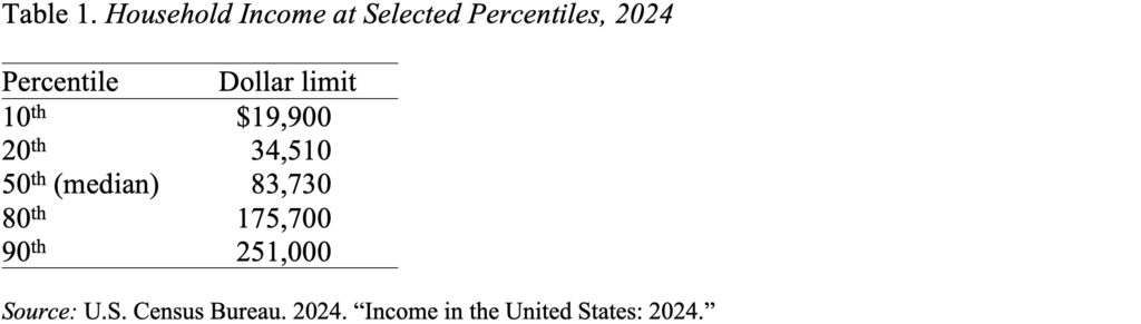
Perception: Households in the Top Half Earn Hundreds of Thousands Each Year.
Fact: If you’re a person who hangs out with financial types and others who worry about retirement income, it’s easy to get lulled into the notion that the mass affluent – households in the top half of the income distribution – have hundreds of thousands in annual income. This is not the case. The 2024 data show once again how little most American families have and how slowly these amounts have increased over time.
Table 1 presents the amounts associated with being at different parts in the income distribution. A household with $83,730 is at the 50th percentile, right in the middle of the income distribution. Those with $175,700 fall at the 80th percentile, putting them in the top 20% of all households. Only those at the 90th percentile and above have incomes in excess of $250,000. While the thresholds must be interpreted with caution – they include old and young, rural and urban, coastal and midland, and small and large – the data do suggest that most households do not have large amounts of income. Combining these income levels with high prices makes it easy to understand why affordability is such a big deal.
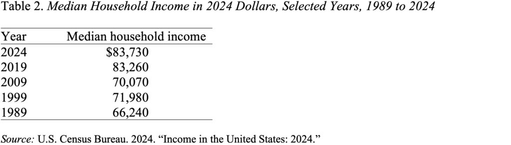
Perception: Economic Growth Means that Earnings and Income Have Increased Rapidly.
Fact: In fact, the long-term trend is not encouraging. While income for the median household has increased somewhat in the last 35 years, the number in 2024 was virtually identical to that in 2019 – after adjusting for inflation (see Table 2). Households, understandably, feel like they’re treading water, and they are.
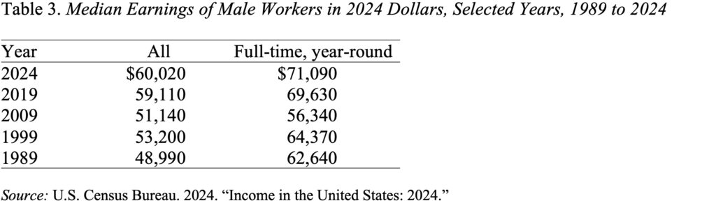
A major reason that household income has not gone up is that earnings – adjusting for inflation – have been relatively stagnant (see Table 3). Real earnings for all male workers in 2024 were only 23% higher than in 1989; the gain for men working full-time, year-round was even smaller – 13%.
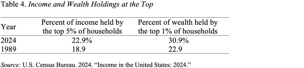
Perception: Growing Income Inequality Is Our Most Serious Problem
Fact: The concentration of wealth is much more extreme than the distribution of income. In 2024, the top 5% of households received 22.9% of all income. In contrast, the top 1% of households held 30.9% of wealth. Clearly if comparable data were readily available for income and wealth holdings, the top 5% on the wealth side would be much greater. So, the first point is that wealth is much more concentrated than income. The second point is that the inequality on the wealth side has increased much faster than on the income side. Specifically, between 1989 and 2024, the share of wealth held by the top 1% increased 35%, while the share of income receives by the top 5% increased 22%.
The bottom line is that those who work for wages and salaries have less money than people generally assume, and they have enjoyed less progress than many think. And while most attention has focused on income inequality, that phenomenon is dwarfed by the high and increasing holdings of wealth. And our tax system enables and aggravates this wealth situation, because while wage earners pay income and payroll taxes, the wealthy can avoid taxes almost entirely.