


The Picture of Investment Diversity

Most people see multicolored chaos in the chart below, which is a visual representation of the returns each year to various types of investments.
Morningstar Inc.’s director of quantitative research, Timothy Strauts, sees something else: the need for a diverse portfolio.
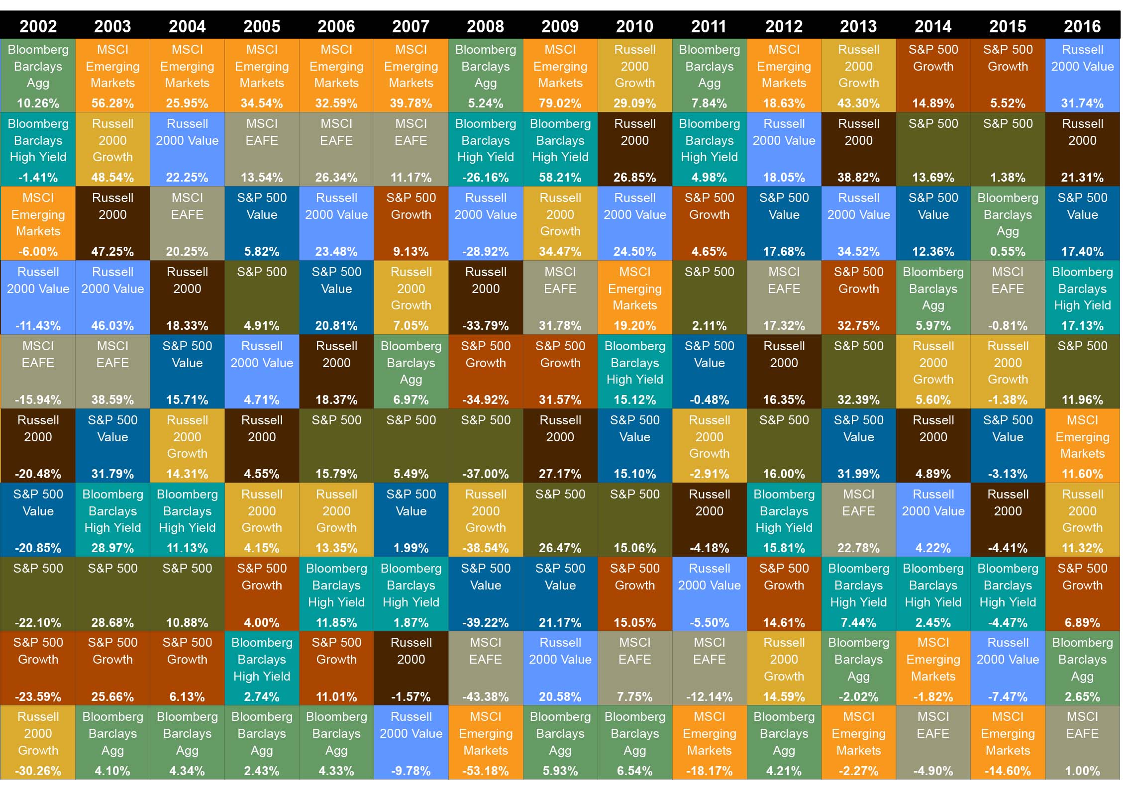
Strauts, like most investment professionals, knows the Callan Periodic Table of Investment Returns. It has been around for 20 years and was just updated with 2016’s returns. Here’s how to read it. A colored square is assigned to each type of stock- and bond-market index. For example, the Bloomberg Barclay’s Aggregate (Agg) bond index is bright green, and the Standard & Poor’s 500 stock index is khaki green – the boxes also give each index’s return for each year.
Stock and bond returns are not well correlated, so investing in both provides diversification that reduces risk and can even out the overall portfolio’s returns from year to year. Now step back and look at the entire chart. This quickly makes clear that the pattern of colors is also unpredictable, further illustrating the benefit of diversification.
In truth, the Callan Periodic table “is not completely random,” Strauts said. For example, one discernable pattern is that annual returns to the risky MSCI index of stocks in developing countries (the orange box) are usually at the top or bottom of a column – and rarely in the middle. The index was up 19 percent in 2010 and down 18 percent in 2011.
“To guess whether it’s going to be at the top or bottom each year – well, who knows,” he said. (Morningstar has its own version of Callan’s table.)
Strauts said investors should keep things simple. “That means keeping a diversified portfolio – not buying just one thing and calling it simple. That’s actually risky.” As the chart also shows.
That’s why he likes target date funds (TDFs), which have become popular in employee retirement savings plans in recent years.
TDFs invest in a diversified portfolio, and the portfolio’s risk level is reduced as the worker approaches his or her retirement date. The overall return to the TDF is reported to the investor. “You don’t see the big ups and downs as much, even though they’re still happening” in the individual investment classes that underlie the TDF, Strauts said.
This also reduces or eliminates the temptation to move money out of an investment fund when it’s losing money. Pulling money out in down years, he said, is “probably the opposite of what you should do.”
Squared Away writer Kim Blanton invites you to follow us on Twitter @SquaredAwayBC. To stay current on our blog, please join our free email list. You’ll receive just one email each week – with links to the two new posts for that week – when you sign up here.
Comments are closed.


Thank you for posting this informative blog with the wonderful illustration. I acquired a lot of knowledge on the various types of investments and the expected returns from these investments. I think this post will help a lot of people out who are looking to gain knowledge on investments. I am looking forward to reading more interesting articles in the future.
Unfortunately, this year-by-year view is grossly misleading. Yes, there’s going to be variation from year to year. But over time—complete market cycles—research has shown that value always wins.
There are a lot of reasons why, ranging from not buying overpriced stocks to losing less, but the data is incontrovertible.
There’s a table like this in the JP Morgan Guide to Retirement, which is a pretty nice resource.