U.S. Social Security Benefits Are Stingy
Alicia H. Munnell is a columnist for MarketWatch and senior advisor of the Center for Retirement Research at Boston College.
OECD confirms U.S. Social Security benefits low and validates methodology of U.S. Social Security Actuaries.
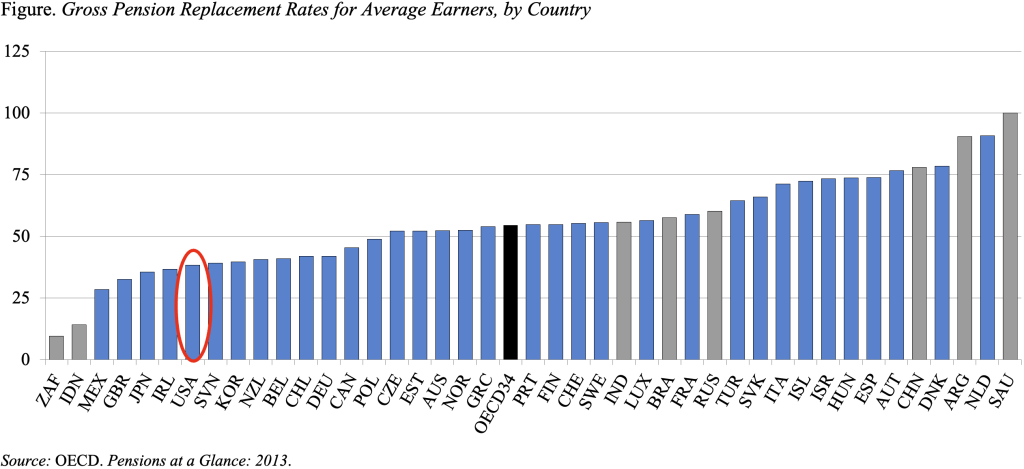
Two recent developments that I have found both annoying and dangerous are the deletion of replacement rate information from the annual Social Security Trustees Report and the coordinated campaign in the press arguing that the elderly have plenty of money. Hence, I was delighted to see a chart in the most recent edition of the OECD’s Pensions at a Glance that addresses both issues.
The chart below shows, for each country’s mandatory retirement system, the gross replacement rate – benefits as a percent of pre-retirement earnings – for single individuals earning the average wage. Comparable data are provided for 34 OECD countries, which include all the usual suspects, and 8 other major economies – Argentina, Brazil, China, India, Indonesia, Russia, Saudi Arabia, and South Africa. Don’t worry if you can’t read the name of each country at the bottom of the graph; the point of the story is that the United States is at the tail end of the distribution, nestled between Slovenia and Ireland. The U.S replacement rate from Social Security is about 40 percent. The folks at the OECD would be very surprised to hear claims that the U.S. has replacement rates for the average worker exceeding 60 percent.

That 40-percent replacement rate should sound familiar because that number used to be reported in the Trustees Report, before all replacement rate information was summarily deleted this year in response to allegations that the methodology was flawed. The reason why the OECD replacement rate matches that provided by the Trustees is that they use the same methodology. The OECD calculates benefits as a percentage of lifetime earnings, revalued in line with economy-wide wage growth.
Of course, the more familiar concept is benefits as a percentage of final earnings. However, if workers earn the same percentage of average workers’ earnings throughout their career, replacement rates based on lifetime average revalued earnings and on earnings just before retirement would be identical. In fact, a recent analysis by the Social Security actuaries showed that this identity held up for a random sample of 200,000 workers claiming benefits in 2011. At the mean, the replacement rate for this group was 38.8 percent using the lifetime earnings indexed for wage growth and 39.2 percent using the last five years of significant earnings. Thus, the two approaches provide the same picture.
It makes the critics crazy that lifetime earnings are adjusted for wage growth rather than just the increase in prices. But wage adjustment is the only way to measure the extent to which people maintain their standard of living, as opposed to buying a bundle of goods available when they were middle aged.
Thus, the OECD chart adds two very helpful data points to the current controversy. First, by comparing U.S. replacement rates to those of other countries – using a consistent methodology – it shows that the U.S. provides some of the lowest benefits in the developed world. Hence, the elderly in the U.S. don’t have plenty of money. Second, the chart affirms the methodology used by the U.S. Social Security actuaries and demolishes the argument that such information should be deleted from the Trustees Report.


